DAN’S Arcade sign v2
Yesterday I stumbled across the Flynn’s Arcade sign at flickr. Shazammy seems to be the one who found it and lucky me he took a good, detailed picture of it. I instantly started thinking about how to redo it for my little arcade corner at home.
 Today I sat down and made the lettering. First I tried to take some fonts and tinkered around with Illustrators offset path function, but in the end it all looked crappy. Fonts are never symetric and so I found myself with uneven spread of the three colors. I ended up drawing all letters by myself. I used the line function to do so and when I was through I copied the path three times over another and gave it different stroke thickness. Done with that, I outlined the strokes. Last step on this part was to cut off unwanted curves and corners on top and bottom of the letters that appear when using thick strokes. Done. A little printout to see how it will look like in real.
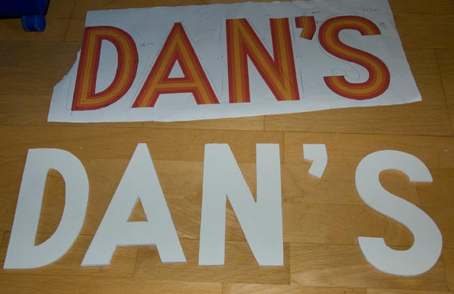 I just returned from the basement, where I carbon copied the letters to a foamboard and cut them out. Quite nice, though cut freehand with a crapy padsaw. I will use those letters to test the wirering and the look before I do them over again… next time with colors aplied and better cut.
On the pic you can see the plot along with all calculations for wirering and the cut out letters.
For the light itself, I was thinking about getting some EL-wires. Those are quite cheap, easy to handle and low on power consumption. Believe it or not: I will need 220cm (2.2m!) of wire to get all letters once. although the final dims of the sing is around 50x22cm! The original Flynn’s got 3 strips each letter. For the colors I go for red or white (original) for the outline and yellow for center. This should give it an authentic touch and the wire is bon marché. 😉